The hidden costs of bad design
In fields like public health, education, and climate action, poor design is undermining programs.
By Daniel Burka

A nurse at a hospital in rural Bangladesh has a massive task in front of her. Every day, she will manage over 100 patients with diabetes or high blood pressure. I have watched many nurses trying to juggle this enormous patient load day after day. They struggle to use a digital health record tool to enter data for each patient, while also trying to counsel patients, take blood pressures and glucometer readings, and distribute medications. If there is any hope of gathering useful data to drive health program improvements, they need a well-designed tool that fits their challenging context and great service design.
I spent the last eight years working on this specific problem. My team and I developed a well-designed digital tool called Simple, that’s… well, simple… and efficient. I have also seen dozens of software tools that failed to gain traction because they were not well-designed.
In my experience, badly designed digital and paper tools in public health have been undermining many well-intentioned health programs.
“If you think good design is expensive, you should look at the cost of bad design.”
— Dr. Ralf Speth, Tata Motors
Badly designed tools take up too much time
Time is possibly the most precious commodity in healthcare: time for healthcare workers to listen to patients, time to do thorough diagnostics, time to make sound judgments about clinical care, and time for compassionate counseling.
It’s painful watching healthcare workers navigating typical software. In many software tools that I’ve seen, healthcare workers are forced through too many steps to enter patient data, confused by strange technical language and idiosyncratic icons, and fundamentally asked to enter too much information at each patient visit.
Almost all software takes up too much clinician time. In fact, according to the excellent book The Digital Doctor, the amount of time that’s required for data entry is one of the most common complaints of American clinicians. Keep in mind that American doctors average more than 20 minutes per patient, while in Bangladesh their peers spend less than two minutes with each patient. The problem only becomes more acute in places with rapid patient encounters.
Every extra click, every confusing data entry, and every slow-loading page degrades the patient’s care and lowers the chance of clinicians actually doing high-quality data entry during clinical visits. Good design can give clinicians back time with their patients by making systems more efficient and intuitive.
Badly designed tools cost millions in trainings
Every time I see difficult-to-use software, the developers will inevitably say: “We will train users on how to use the software.” In much of healthcare, training users is the standard way to deploy new digital tools. It’s a given that users will not only receive intensive training but that they will remember their training months later. In reality:
- Users forget their training
- Staff turnover is high and new healthcare workers are not trained on the software
- Software changes and training is out-of-date
Why do we think that “professional” tools don’t need to be intuitive? It’s interesting that many healthcare workers will use WhatsApp for work. No one taught them to use WhatsApp. Consumer software developers, like the WhatsApp team, invest in design and user research so that their tools are easy to use. Before you dismiss this argument with “But, WhatsApp is just a simple chat tool!”, consider that WhatsApp is frequently a patient retention app, an internal hospital intranet, a task app for community healthcare workers, etc. If you asked most healthcare developers to make a tool that supported those healthcare worker tasks, they would create a complex digital tool that would require formal training.
Training is expensive. In many places, healthcare workers will take half a day off work, travel to a conference center, and receive formal training from paid trainers. This is all very high cost on stretched healthcare systems. Plus, add on the long-term cost of confused healthcare workers who have forgotten parts of their training.
Badly designed tools undermine data quality
In many public health programs, great data is key. If healthcare workers collect timely data, you can see what’s going on and make interventions. For example, in a diabetes program, if you get good data from each patient visit, it’s possible to see which hospitals are helping their patients to control their blood sugar levels and which patients are struggling. Or you can see which hospitals are keeping patients coming back regularly and which hospitals are losing their patients.
“Bad data is worse than no data.”
— Widely cited principle in stats and data science
The only thing worse than no data is bad data, especially when you don’t know it’s bad. I’ve seen many badly designed tools in public health that lead to enormous volumes of bad data that undermine entire programs. Causes include:
- Too much required data. Almost all health programs require more data than they need. This often means that users just enter garbage (i.e. fake data) in order to complete the form.
- Confusing data fields. Very few teams actually test their forms with real healthcare workers. I’ve seen software used by low-literacy community health workers that asks for “Pharmacological management” instead of “Medicines.” If you use language that your users don’t understand, wrong data gets entered.
- Difficult-to-use patient search. Finding the right patient is one of the gnarly challenges in health systems. In Bangladesh, a single hospital might have 500 women named “Sharmin Begum.” If users can’t find the right patient fast, they will enroll the same person again or enter the information for the wrong patient. This means that we end up with duplicate patient data that muddies reports.
- Badly designed software logic. Most healthcare tools have clever conditions that trap users in error loops. For example, look at the way patient ‘age ranges’ are typically designed. Say a cancer screening protocol requires checkups for anyone over 30 and this logic is baked into the software so only patients >29 years old can be enrolled. But what if nurses notice that people under 30 are showing symptoms? Healthcare workers will falsify the data to enter the minimum allowed age (as a clever workaround) and your data will show a fake spike of 30-year-olds at risk of cancer.
Bad service design leaves patients waiting
Long lines are one of the biggest challenges in many hospitals. That’s a design problem. There are many reasons that long lines develop: patients aren’t triaged well, the front desk isn’t well-staffed, software is too slow, all patients are forced through the same intake process, etc.
Good service design can help. What if patients could self-enter some of their intake data while they wait? What if returning patients could skip the main queue? What if drugs could be delivered to the patient’s house? What if patient counseling happened during wait times? There are many tactics to reduce lines in hospitals and, with good design, better patient experiences are possible.
Badly designed graphics kill patients
Doctors base a lot of their decisions on clinical treatment protocols. In many doctors offices around the world, you’ll see several protocols taped to the wall and the doc is meant to refer to the poster when they’re managing a patient. For instance, a patient presents with a cough that might mean tuberculosis and the doc knows to look at the poster to choose the right lab test and then start the appropriate treatment based on the patient’s stage of disease.
Unfortunately, most treatment protocols are designed by academics or health bureaucrats. See the diabetes protocol below (blue). All of the data is correct, but the design is convoluted and hard to follow. The hypertension protocol (red) has very similar information but a designer (me!) took the time to present the data so that it is easy to use when a doctor is in the middle of patient care.
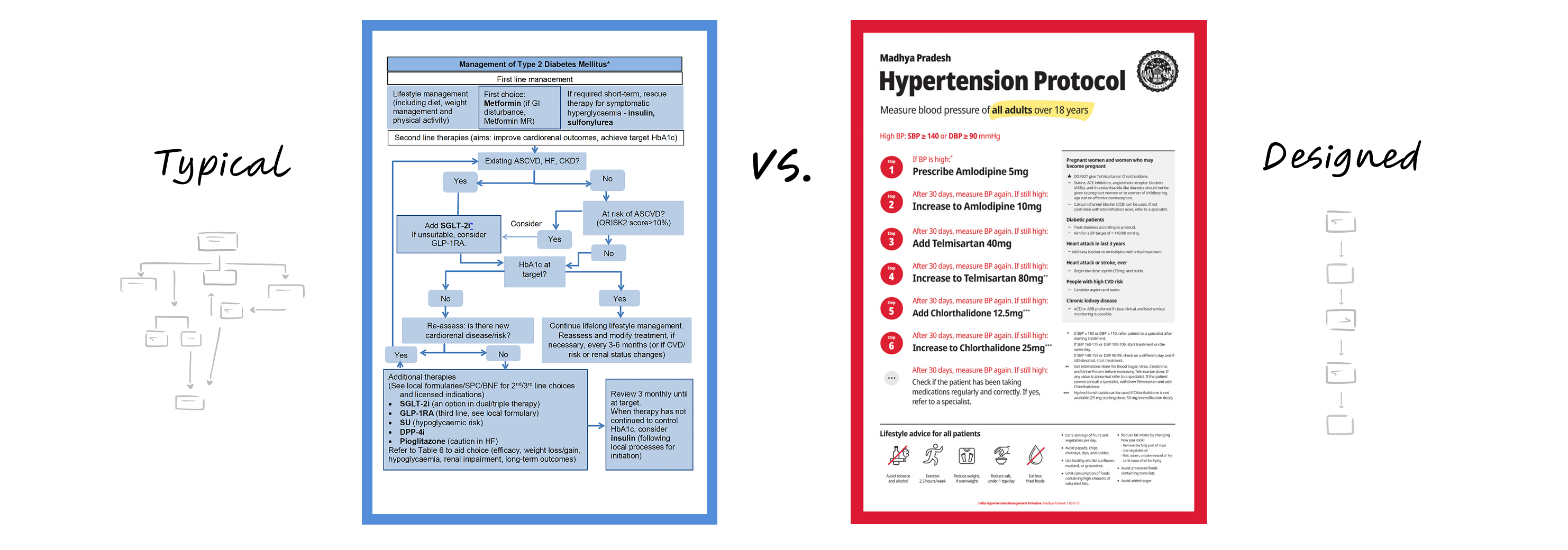
This is the kind of bad design that kills patients. Not because the information is wrong, but because the data is hard to use correctly in the real world context. The next time you’re in a hospital, take a look around and observe all the ways in which a good designer could make the information easier to understand. The impact could be enormous.
The hypertension protocol poster in the example above is literally used today in tens of thousands of doctors offices in dozens of countries like Nigeria, Ethiopia, India, the Philippines, and Vietnam. It took me just four hours to design the first version.
What should be done?
A few years ago, I was asked by a well-known public health technology company to give them feedback on their ideas for improving the design of their products. Their proposal had eight ideas for improving design. None of those ideas were to hire a designer. When I found out that they didn’t have a single designer on staff (or even contract!), I obviously suggested that they start by hiring an actual designer.
- Hire designers. You should really hire designers and support them if you want better design. Hire at least one senior design leader who can help you diagnose your challenges and prescribe the type of designers you need to succeed.
- Coach everyone to use design methods. I get in a lot of trouble with designers for saying this, but designers aren’t the ones who can design. For example, if you’re trying to reduce patient waiting times in a hospital system, you can use service design techniques in your public health or Ministry of Health team.
- Do user research. User research means talking to “users” (e.g. patients or healthcare workers) in unbiased ways and looking for strong patterns. User research is a particular skill and hard to do well. Learn more about user research and then find ways to talk to your “users” as often as possible.
- Involve design early enough to make a difference. Design is often used as a nice coat of paint. People will hire a designer to make some pretty-looking posters or polish the user-interface of a software product. This is too late to have a significant positive impact. If you want to avoid the high costs of bad design, incorporate design from the planning stage.
For further reading on this subject check out:
- Jared Spool: The Cost of Frustration
- Marta Fernandez: Why Bad Design Costs More Than Good Design